Branding a FinTech unicorn facing down the wolves of Wall Street.
It’s a B2B story as old as time: a quick and nimble upstart enters a marketplace dominated by a well-established giant with deep pockets and a venerated name.
Bloomberg Terminal is the de facto tool of the Wall Street trader, its brand synonymous with the status quo of business technology. In the financial ecosystem, this wolf had little competition.
Until OpenFin moved into the neighborhood.
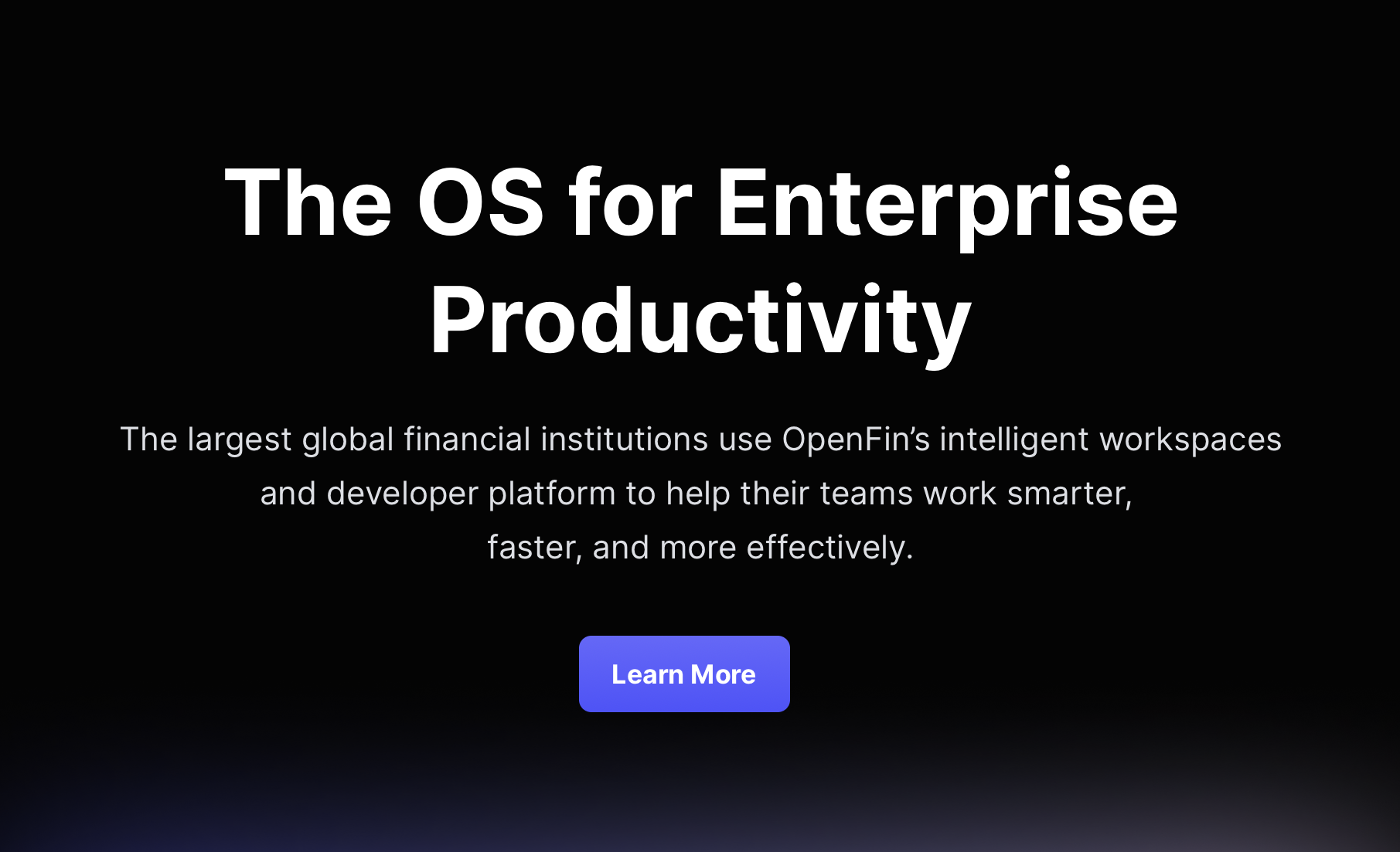
A FinTech company with an open-source alternative, OpenFin’s constantly upgraded plug-n-play platform enables developers and in-house IT to customize and package financial industry desktops and dashboards. It can instantly integrate legacy software with the latest unbundled apps. Onboard new software within days instead of months. And do it all at a fraction of Bloomberg’s cost.
So OpenFin declared open season on the biggest wolf of Wall Street. But they didn’t have a defined brand or an effective digital presence that they could use to spread the word.
How to deal with wolves?
Use big bricks.
Working directly with the CEO, we positioned the brand as a classic Davey-vs-Goliath story that immediately raised OpenFin’s public profile and helped secure millions of dollars in new rounds of investor financing. The press called OpenFin “a fast front-end upgrade path” backed by “Wall Street big beasts” that “helps financial institutions create and upgrade trading apps as quickly as companies update apps on smartphones.”
Instead of competing with emotions and hyperbole that would carry little weight with the finance crowd, we isolated and leveraged those advantages, building them into pillars that addressed both IT stakeholders and the internal partners who rely on their expertise.

Counter the competition’s huff-n-puff.
To make our case, we focused on OpenFin’s capabilities. Specifically, we leaned into three areas of concern for IT and C-suite decision-makers that coincided directly with OpenFin product benefits:
Power.
Better software distribution resulting in faster, better, more fine-tuned control over the digital trading environment.
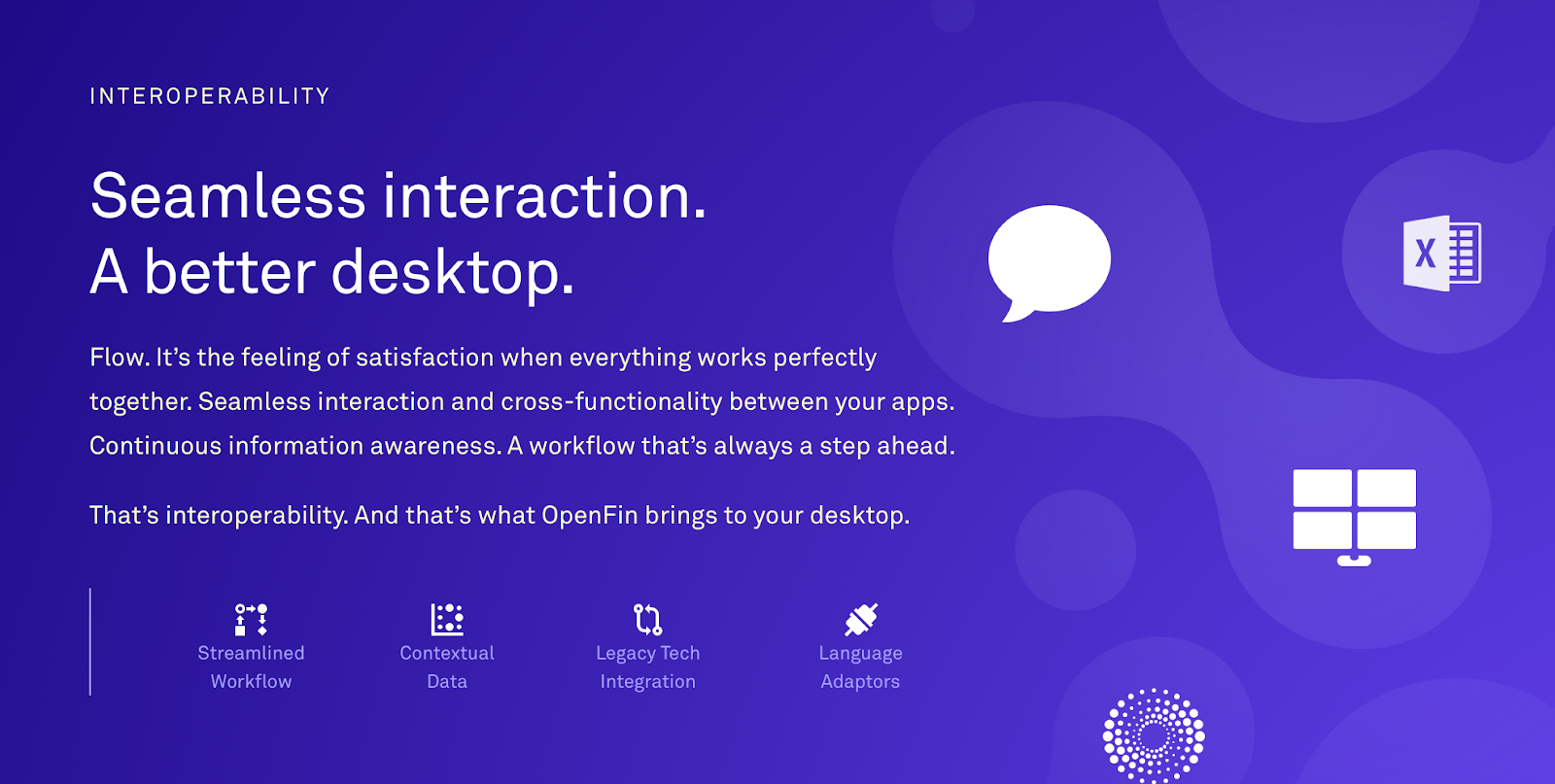
Flexibility.
Interoperability among new and legacy apps that offers customization, refining and packaging without limits.
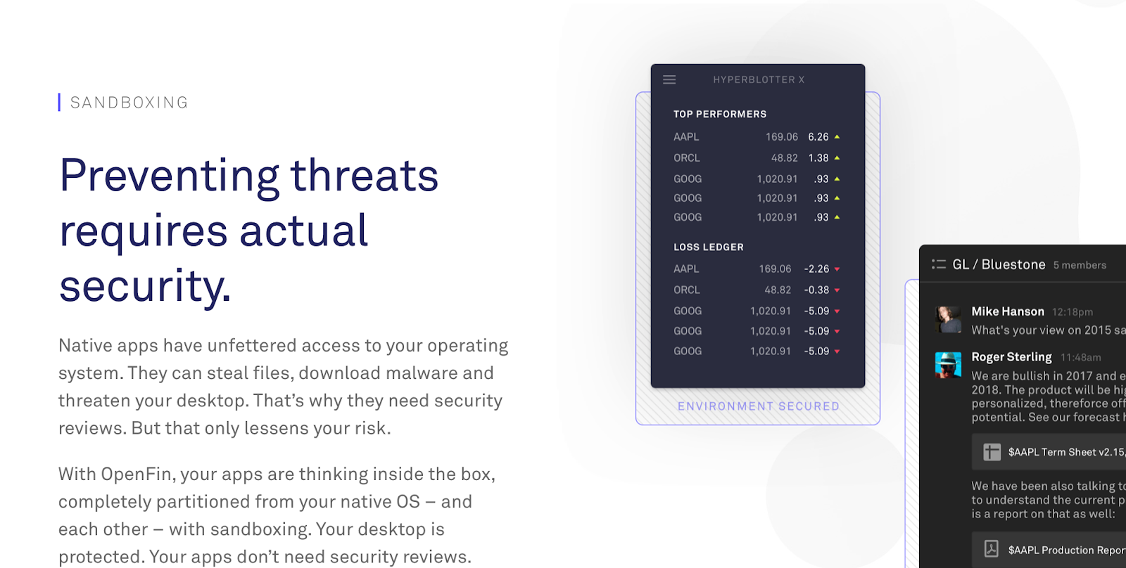
Security.
Ironclad protection that provides a different way of maintaining robust defenses.
Keep the story simple.
Language
OpenFin’s brand proposition was challenging to articulate because it had three primary audiences:
- Finance industry execs who might be technologically illiterate.
- CTOs and IT decision-makers who would expect a deeper dive into product particulars.
- Developers whose enthusiasm needed to be piqued in order to attract talent.
Minding those layers, we first crafted top-level language that was simple and conversational, framing highly technical concepts in easy-to-digest terms. Virtually anyone could visit OpenFin’s site or read their blog to get a grasp of the product’s value proposition. Then, as site visitors drilled down, they found more detailed and technical content.
From simple…
…to complex.
Visuals
We employed simple ‘90s-style graphics using dots to represent information and interconnected ‘blobjects’ to represent interoperating / cooperating software environments.
The OpenFin logo symbolizes the viral, interconnecting nature of information — and the way OpenFin partitions each element of its ecosystem for security. The shape is both organic and orderly, with a single opening indicating future connections and the literal ‘openness’ of the product’s open-source framework.